
On any screen
The same Dashboard runs on a laptop, a tablet and a phone. It adapts to the width it has, and you can lock a layout in from the Layout button (see Your workspace).
Laptop and desktop
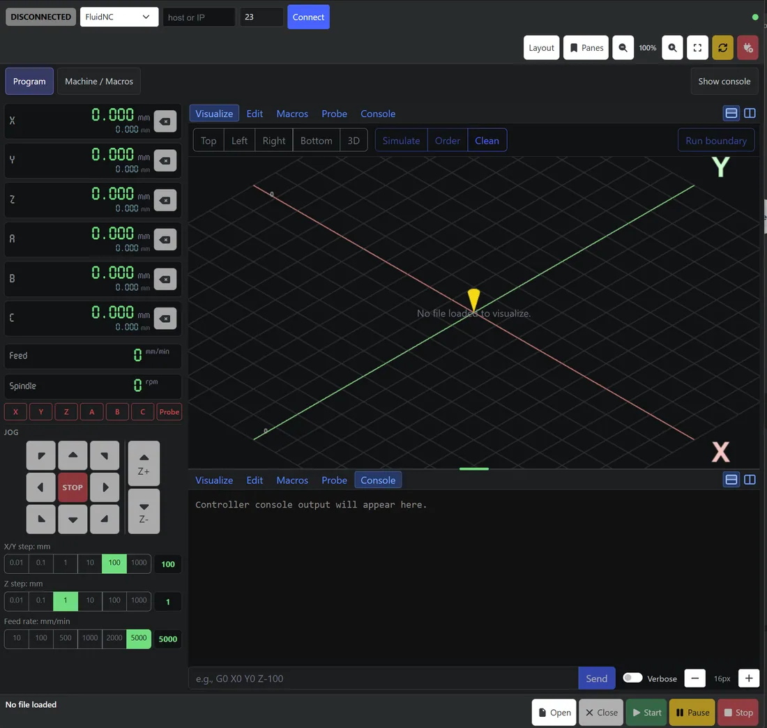
On a wide screen the Dashboard shows three columns: position and jogging on the left, your panes in the center, and macros, spindle, overrides and machine controls on the right.
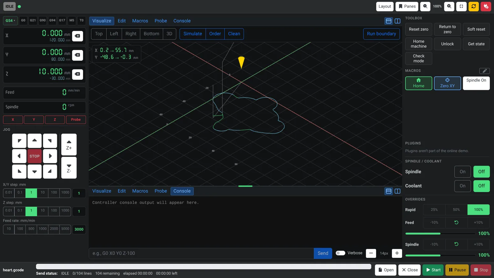
Small tablet
On a small tablet the Dashboard keeps the essentials in view. Held sideways, position and jogging stay on the left and tabs switch between Program and Machine / Macros. Held upright, a compact strip along the top shows X, Y and Z, and the tabs become Position / Jog, Program and Machine / Macros.
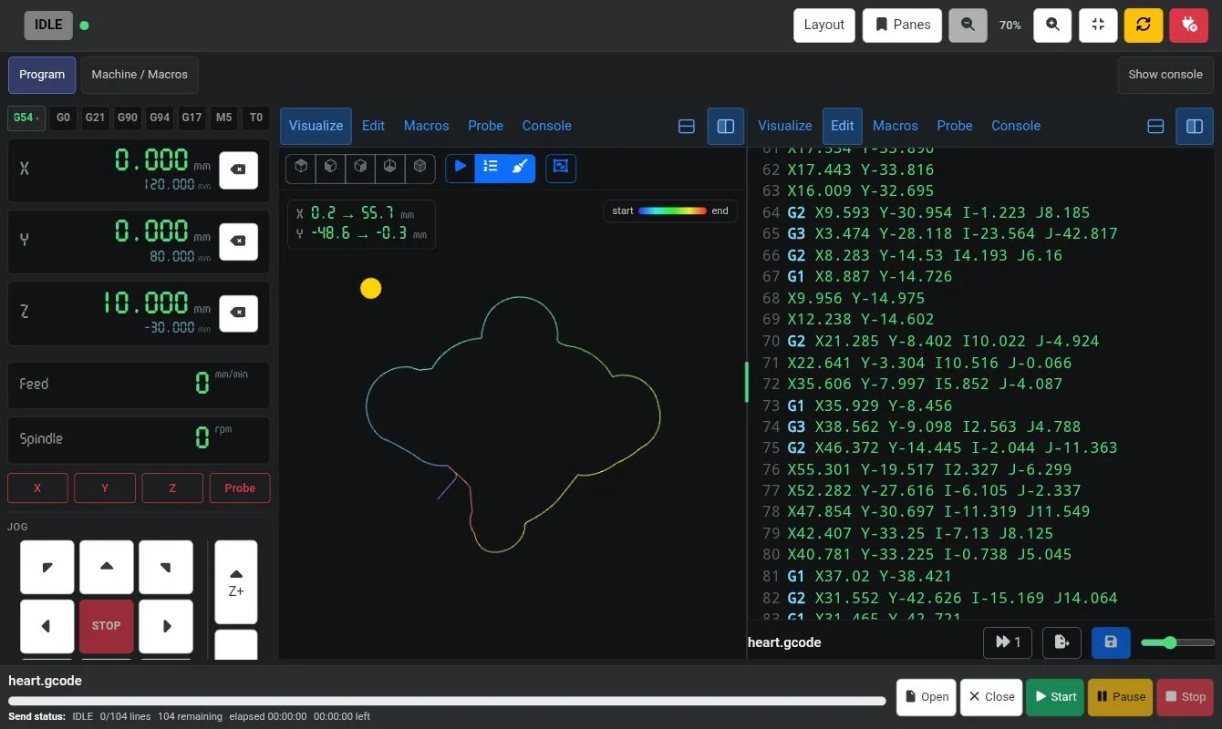
Held upright, the panes stack. Choose what each pane shows, just as on a large screen.
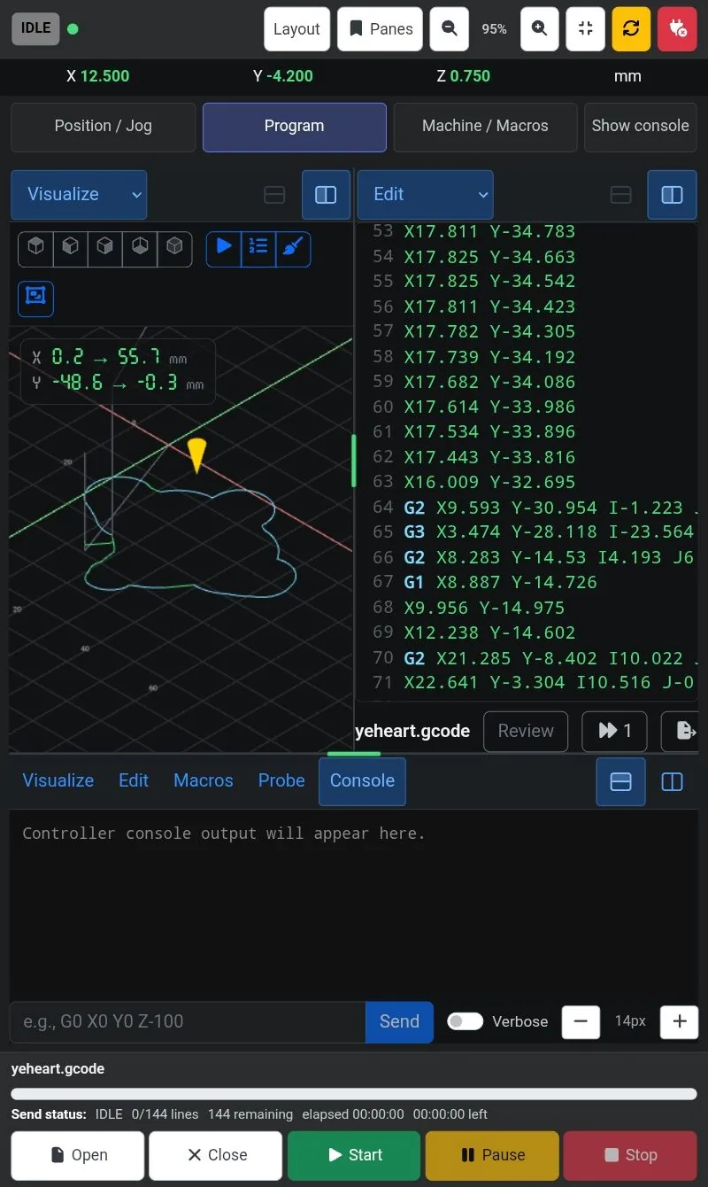
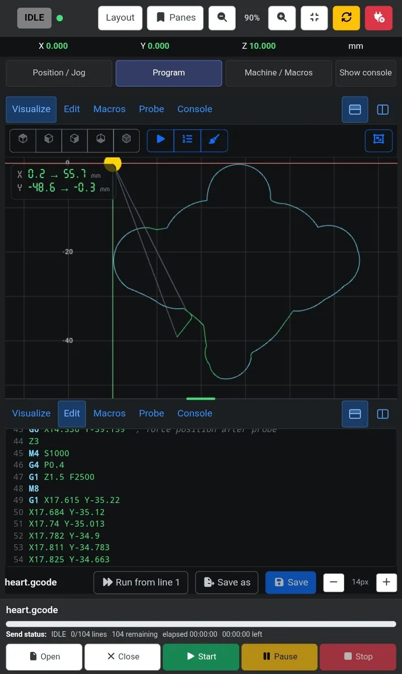
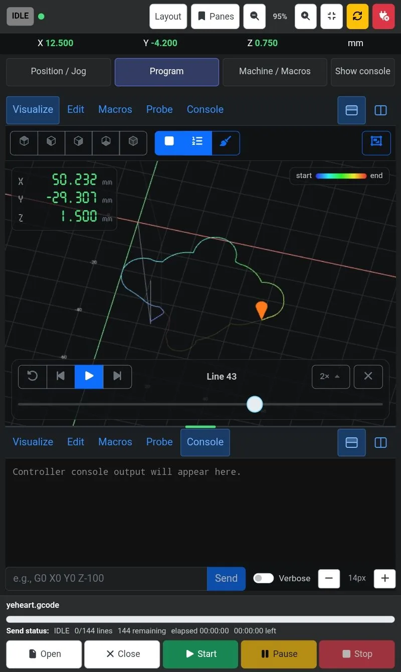
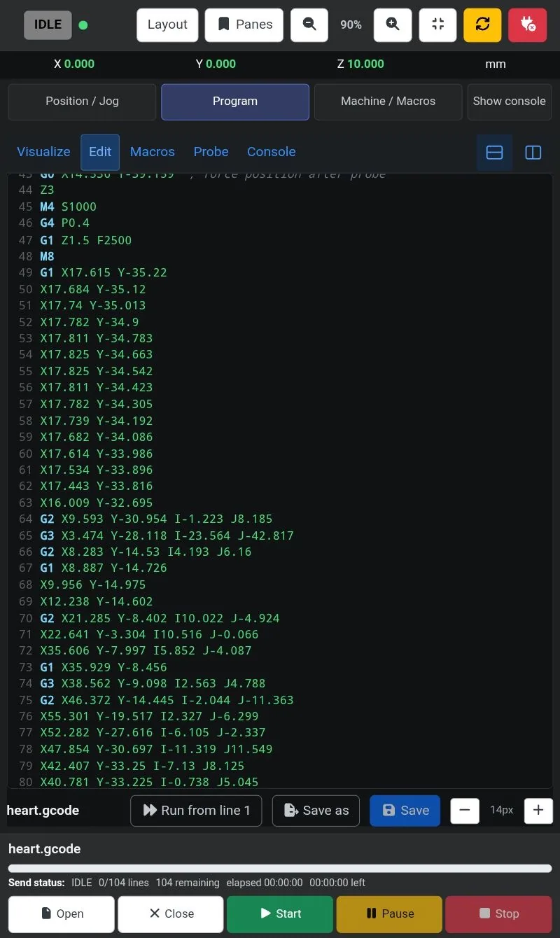
A single pane can also take the whole screen, which is handy for reading and editing G-code.
Phone
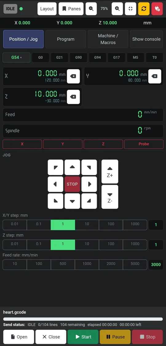
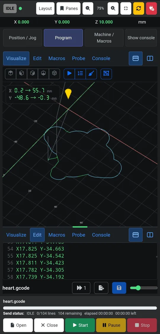
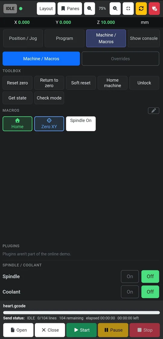
On a phone the Dashboard uses one tab at a time: Position / Jog, Program and Machine / Macros, with Show console alongside. The controls stay large enough to use by touch.
Connecting from another device
Open the Dashboard from any device on your network at http://<UGS-computer-address>:8080/dashboard, and connect to your machine from the controls at the top.
Different layouts per device
Layouts are saved separately in each browser, so your phone, tablet and desktop can each keep their own. See Saved layouts & backup.